T-Mobile is a company unafraid to speak its mind. What if its website were revamped to better help customers purchase products without losing T-Mobile's bold and unique branding?
Overview
Project Type: case study
Client: T-Mobile USA
Platform: website
Deliverables: wireframes, hi-fi mockups, clickable prototype (video)
Tools: pen & paper, whiteboard, Xtensio, Photoshop, Sketch, InVision
Goal
With T-Mobile's branding in mind, our goal was to redesign the e-commerce arm of T-Mobile's website to enable current and potential new customers to search, browse, and purchase mobile device accessories more easily.
T-Mobile's Business & Branding
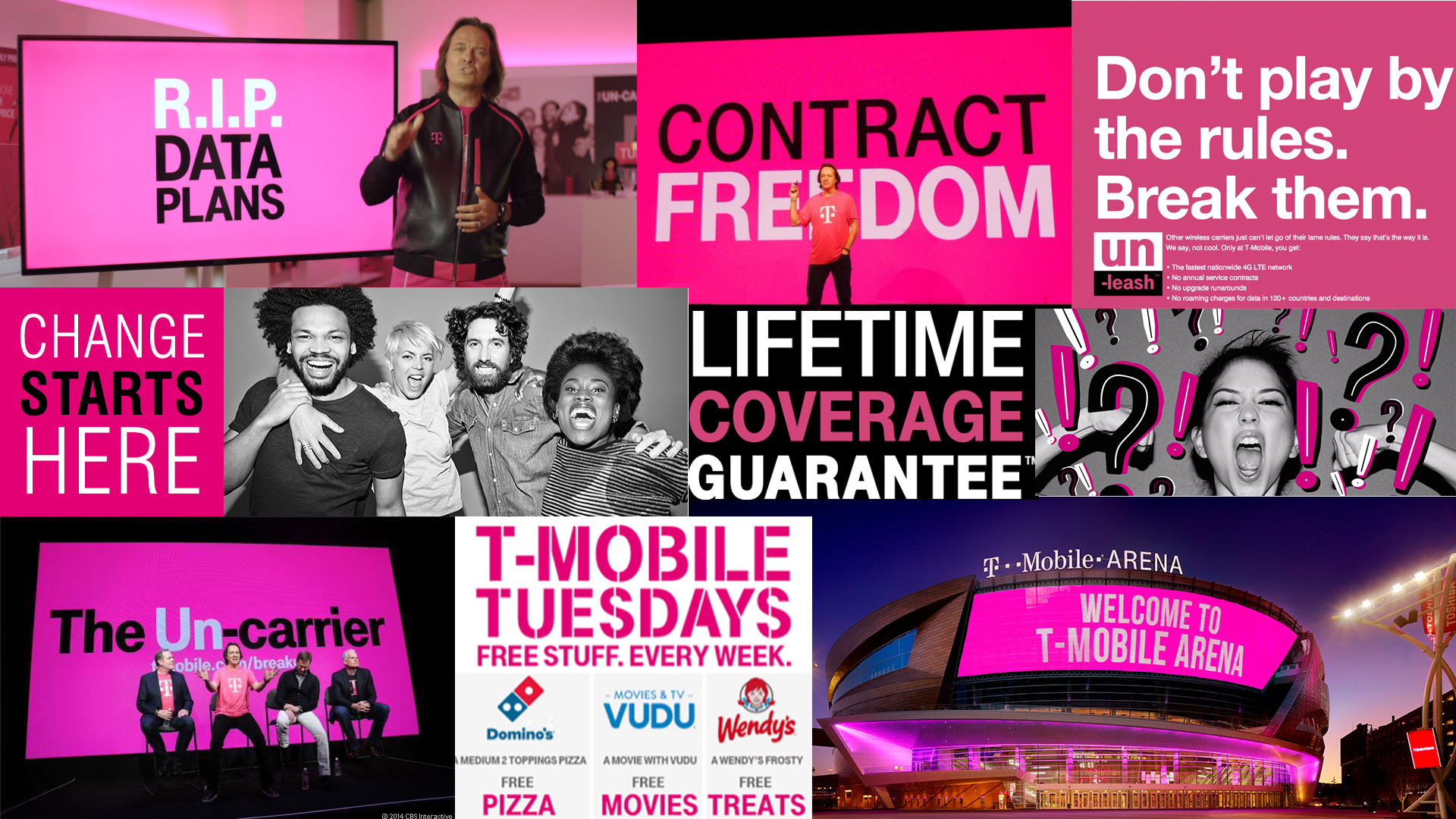
Ever since T-Mobile rebranded itself back in 2013, it has been gaining market share. Consumers have resonated with "The Un-Carrier" branding, sick of contracts and hidden fees. As a result, T-Mobile has attracted the most new subscribers in the industry over the past two years.
T-Mobile's loud and bold branding is working.
Keeping this in mind, in the redesign, I made it a point not to interfere with T-Mobile's brand, and instead, focus on improving on other user touchpoints.
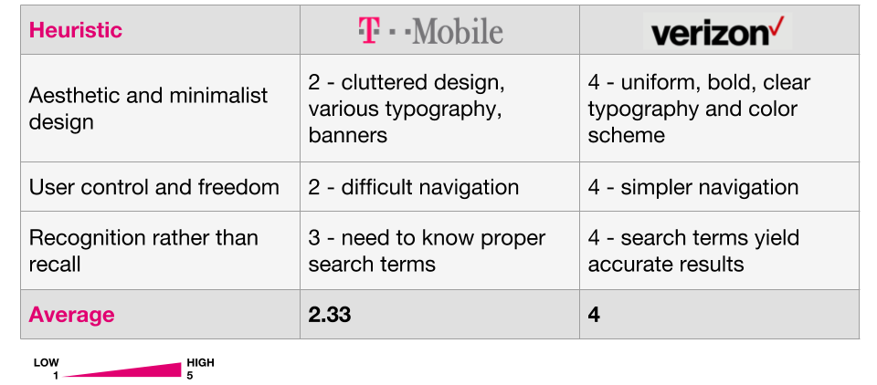
Comparative Analysis
Next, I determined key heuristic differences between T-Mobile's website and that of the industry's leader: Verizon. I utilized Jakob Nielsen's 10 Usability Heuristics for User Interface Design, a powerful heuristics framework used by the industry.
User Research
In order to understand the user, I conducted interviews to understand T-Mobile users' needs and touchpoints with the e-commerce arm of the website. Some key questions asked:
• What factors go into your decision of purchasing products online, as opposed to in the store?
• When researching a product, where do you typically get your information from?
• What do you visit your phone service provider's website for?
• Tell me about the products you purchase on your phone service provider's website, if any.
• Show me how you would go about purchasing a VR headset from T-Mobile's website.
I used the data from the interviews to develop a persona and user flow.
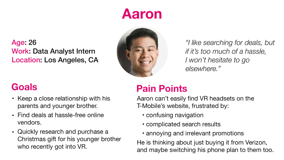
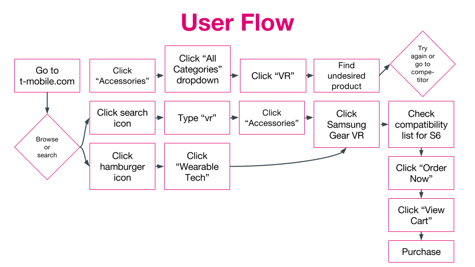
The current user flow above led to much of Aaron's pain points, so I focused on streamlining the user flow with three major changes:
1) recategorizing products
2) overhauling global navigation
3) simplifying aesthetics
Ideation
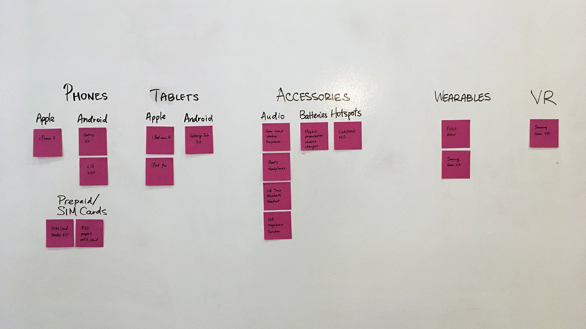
I conducted several card sorting exercises to understand the users' mental organization of products and discovered several insights for overhauling the information architecture:
- Need for a hierarchy of categories (e.g., phones, tablets, accessories) and subcategories (e.g., Apple, Android, audio, batteries)
- Virtual Reality (VR) needed its own category
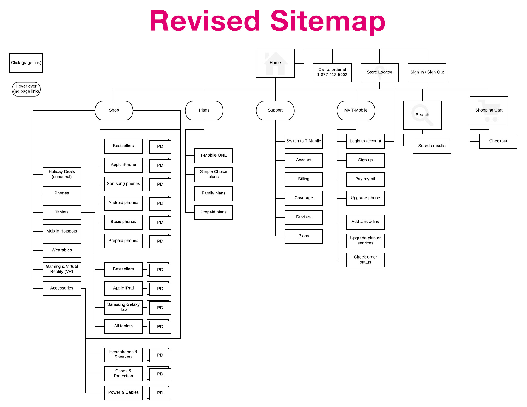
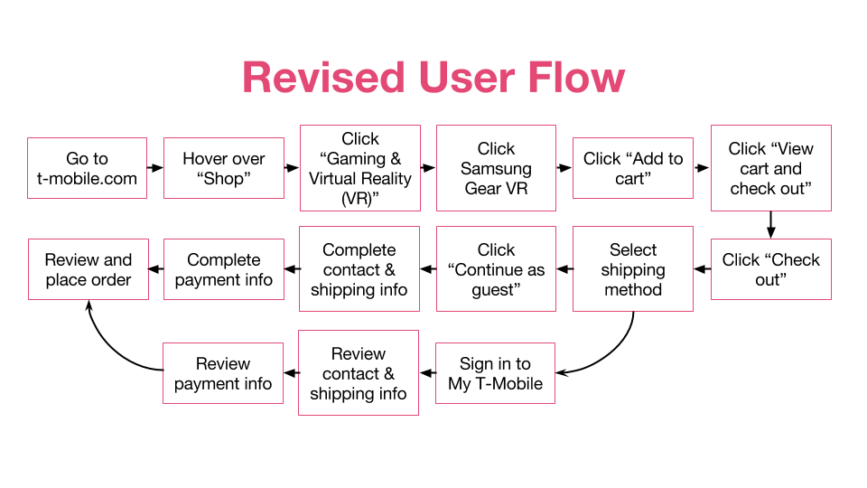
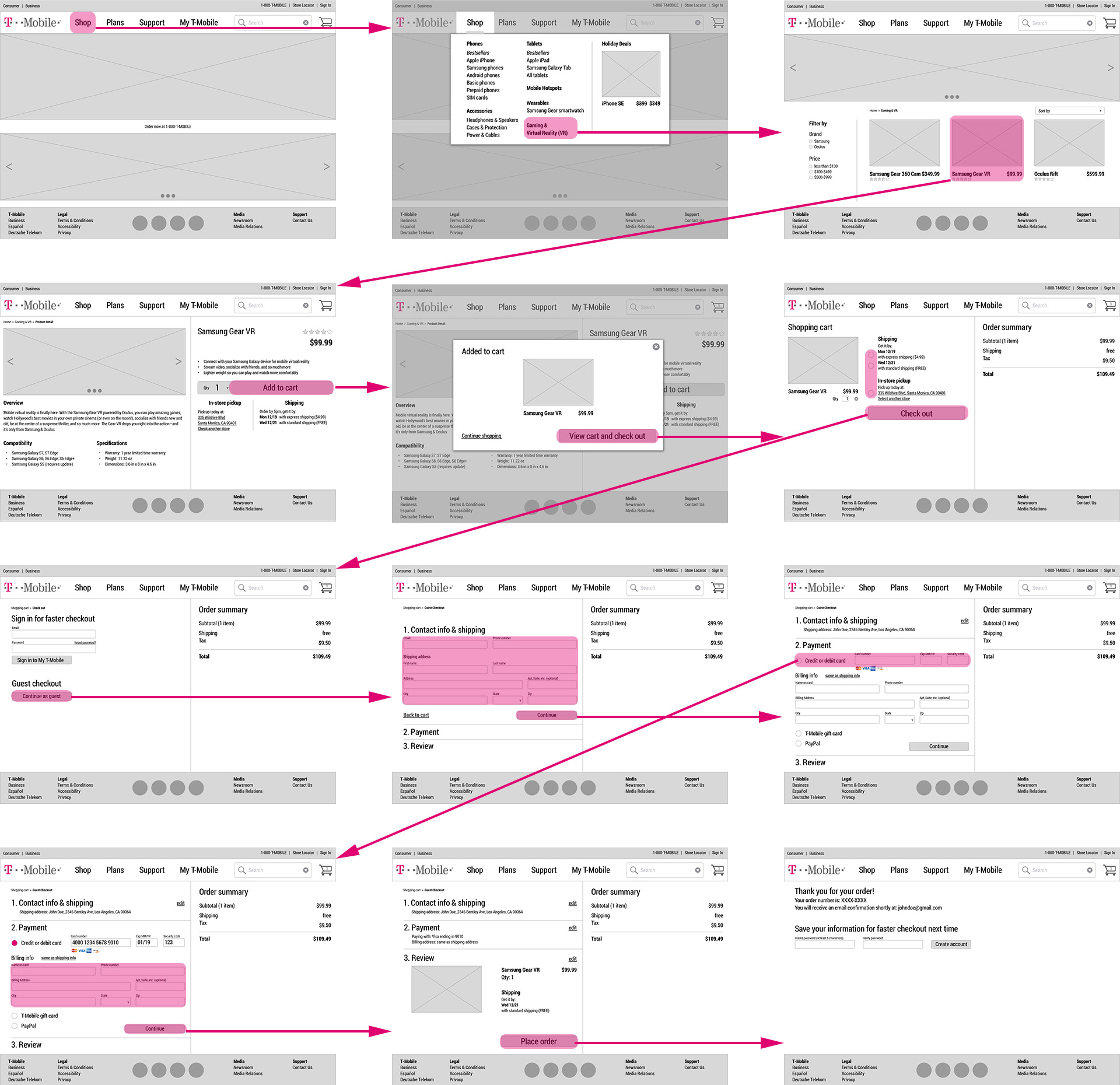
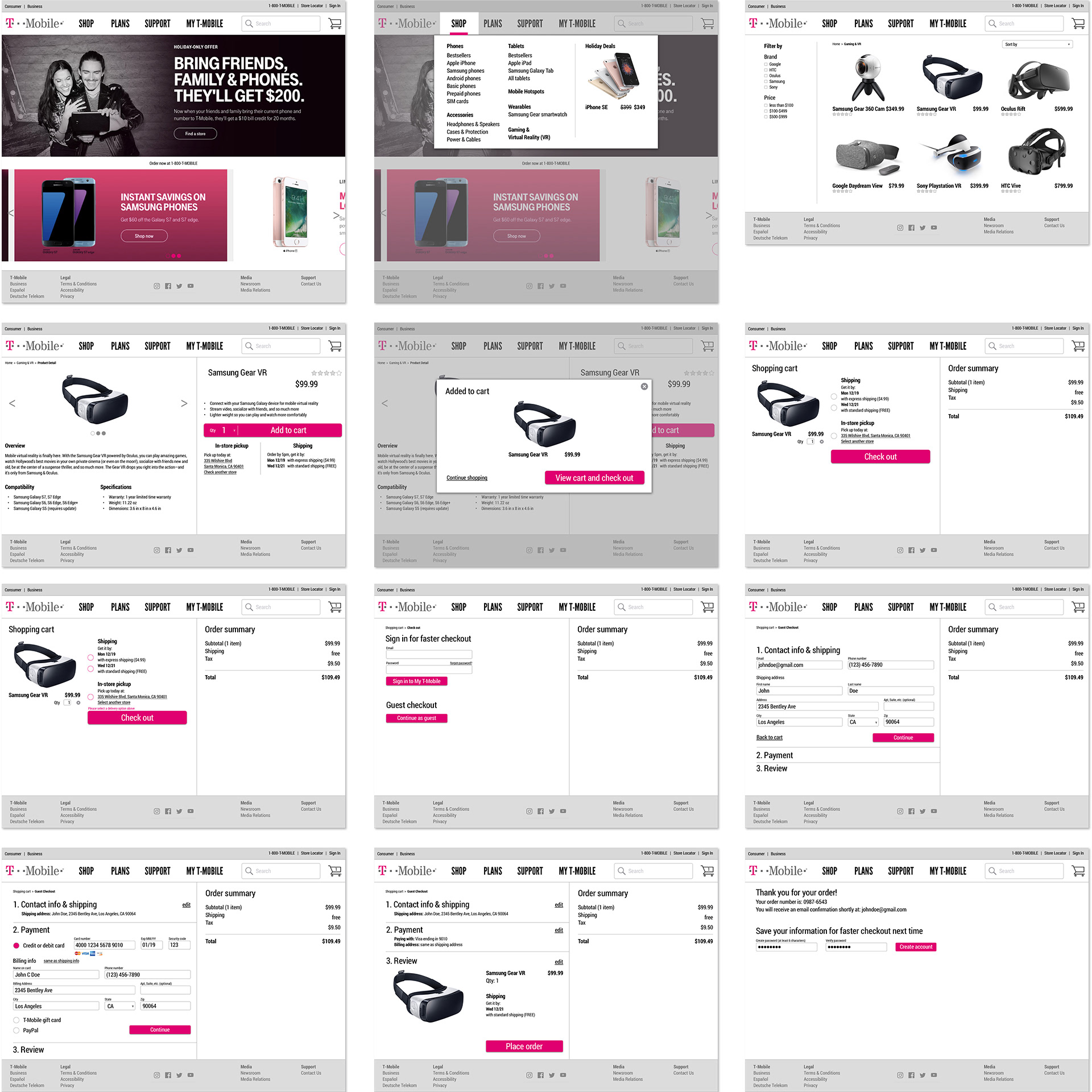
With a new sitemap and simplified user flow, I was able to begin designing the new T-Mobile website, starting with wireframes, mockups, and ending with a prototype.
Low-Fi Wireflow
Hi-Fi Mockups
Prototype
Next Steps
• Develop the rest of the website's pages in sitemap to accommodate other user flows and needs
• Further user testing and design iterations are needed before deployment